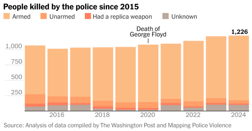
I’m not actually sure this is true. There is no complete national tracking of police shootings, and if you look at the supposed data before this graph starts, it’s basically all just flat year by year, which seems pretty suspect. I highly suspect that people are processing the unknown percentage of incomplete and inconsistently-parameterized data that they have, basically a whole bunch of incomplete bullshit, into a single magic number, which suddenly blesses it with the illusion of comparability year by year which it does not have.
I suspect that the sudden rise in killings starting in 2020, which coincided with near-universal bodycam adoption, heavy pressure from the feds to reform bad departments, serious efforts by the FBI to actually track complete data or as near to it as they could gather, was a result not of increased killings but an increase in the proportion of police shootings that went into the graph.
I could be wrong. That’s just my feeling.
Also, yes, holy shit these are some bad colors to choose.
It doesn’t help that suicide by gun is considered the same as gun violence. Accurate metrics are important, and the people upstairs don’t want to provide.


I’m not actually sure this is true. There is no complete national tracking of police shootings, and if you look at the supposed data before this graph starts, it’s basically all just flat year by year, which seems pretty suspect. I highly suspect that people are processing the unknown percentage of incomplete and inconsistently-parameterized data that they have, basically a whole bunch of incomplete bullshit, into a single magic number, which suddenly blesses it with the illusion of comparability year by year which it does not have.
I suspect that the sudden rise in killings starting in 2020, which coincided with near-universal bodycam adoption, heavy pressure from the feds to reform bad departments, serious efforts by the FBI to actually track complete data or as near to it as they could gather, was a result not of increased killings but an increase in the proportion of police shootings that went into the graph.
I could be wrong. That’s just my feeling.
Also, yes, holy shit these are some bad colors to choose.
And they should plot the numbers per capita to correct for population changes.
It doesn’t help that suicide by gun is considered the same as gun violence. Accurate metrics are important, and the people upstairs don’t want to provide.