I really don’t like the design of the progress pride flag, and I couldn’t really put my finger on it until I saw this: https://nava.org/good-flag-bad-flag
For reference, here is the flag I’m referencing as “bad flag”:

And here is the original:

So, the original has too many colors, but it’s the colors of the rainbow. In order. It’s recognizable from really far away, and it’s dead simple to draw.
With the Intersex flag, that’s 14 colors. There are three shades of “purple”. The circle won’t be visible from far away. The chevrons are too thin to be very recognizable from far away.
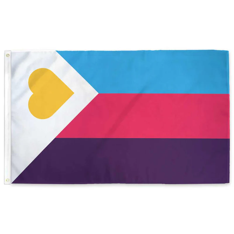
It’s not like there aren’t good pride flags. Like there are AMAZING ones:


Edit:
In case you don’t know what these are: https://flagsforgood.com/collections/pride-flags


The progress flag is copyrighted by one Daniel Quasar, and he sporadically exercises his copyright on people who use or sell designs involving the progress flag. Or so I’ve heard. Anyway, for this reason, I avoid using it.
The primary reason it’s copyrighted is to prevent corporations from profiting off of it.
and…?
i was sceptical of this claim but it appears you’re dead right
https://gaycitynews.com/we-need-walk-away-progress-profit-flag/
rest of the article is interesting too
this just makes it all the more baffling that this graphic-design-is-my-passion gaudy clashing mess of a flag is the one you see everywhere now
That’s wild. I would have retained the copyright too, but for the purpose of suing the fuck out of people who misuse it
Even if that were what he’s doing, I would still avoid using it as I’m a supporter of the public domain on principle. If something is essentially public domain, it should be fully public domain.