I really don’t like the design of the progress pride flag, and I couldn’t really put my finger on it until I saw this: https://nava.org/good-flag-bad-flag
For reference, here is the flag I’m referencing as “bad flag”:

And here is the original:

So, the original has too many colors, but it’s the colors of the rainbow. In order. It’s recognizable from really far away, and it’s dead simple to draw.
With the Intersex flag, that’s 14 colors. There are three shades of “purple”. The circle won’t be visible from far away. The chevrons are too thin to be very recognizable from far away.
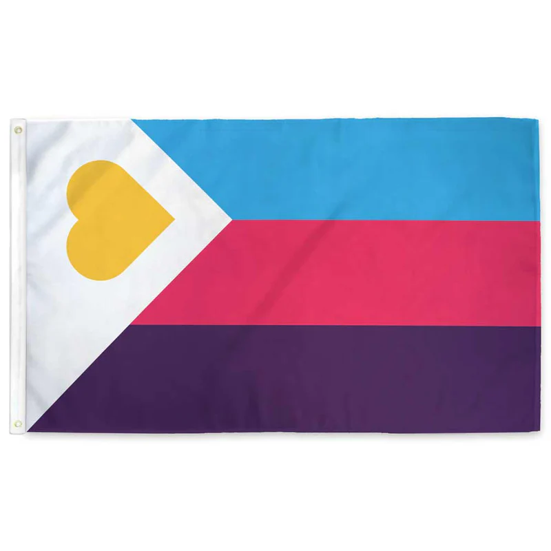
It’s not like there aren’t good pride flags. Like there are AMAZING ones:


Edit:
In case you don’t know what these are: https://flagsforgood.com/collections/pride-flags


Weirdly , I think the chevron works. But instead of adding all of the extra stripes , I think it would have been better to make the chevron a single color.
Gilbert Baker, before he died, added a lavender stripe to the original flag to for ‘diversity’. I say we blend the chevron with Baker’s vision and have it be a singular lavender color
That said, while I think that would be more aesthetically pleasing, I have come around on the progress pride flag in the same way that I like the flag of Maryland. It’s so busy that it’s circled around from being ugly to charming.