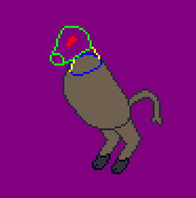
- Blue lines indicate base of neck
- Yellow lines indicate neck
- Green indicates head (with snout outlined)
- Red indicates eyes
Want to make sure nothing jumps out as blatantly wrong with proportions/perspective before I proceed any further, so that I can correct those mistakes while it’s still easy to do so. I am not anything resembling a trained artist, so any advice would be greatly appreciated, even if it seems obvious.
The center of balance seems too far forward. I think a more upright posture and larger hind legs would be an improvement.
I’ll try tweaking it some. Thanks for the feedback!
I’ll echo the response that it could be weighted too far forward, but that could also be used with appropriate arms and head to convey an aggressive posture. If it’s cohesive with other sprites, some detail or shading on the body could be nice.
deleted by creator
Thank you, and hell yeah I am! I have a demo out since the end of last year, and the game’s come a long way since then.
deleted by creator