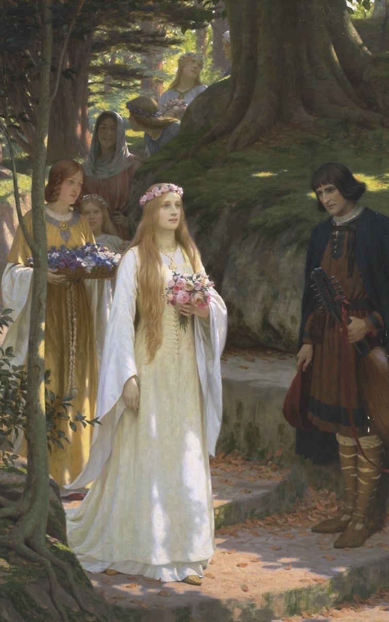
“Milady, I have shown mine lute to you. Prithee respond.”
Something is kind of off here. The subject matter and the style are Pre-Raphaelite but the colours seem too muted and the shadows should be darker.
It may simply be the photographer/scanner used, or when it was taken. For example, ones in public ownership in the UK tend to all be photographed for artuk.org (the link is to other paintings by the same artist), with pretty consistent guidelines, so they all tend to be fairly consistent with each other in terms of colour, brightness, contrast etc - although ones taken as little as a few years ago may be completely different in visual quality. Ones in private ownership, or overseas galleries may be done with completely different lighting, settings and colour reproduction.
I looked up the title and it seems like there are versions of this painting with the more appropriate colours. I’m not sure if that means this post is wrong or if someone else made edits.
If you look at his other paintings many are brighter. I suspect this picture is more of the odd one out.
Maybe it’s dirty.
Ok thats interesting, I wonder why…